Next week when you sign into trellis to create or update your fundraising page you’ll notice things look a little different. We’re giving you a sneak peek on some of the new features that we are most excited about below!
New look
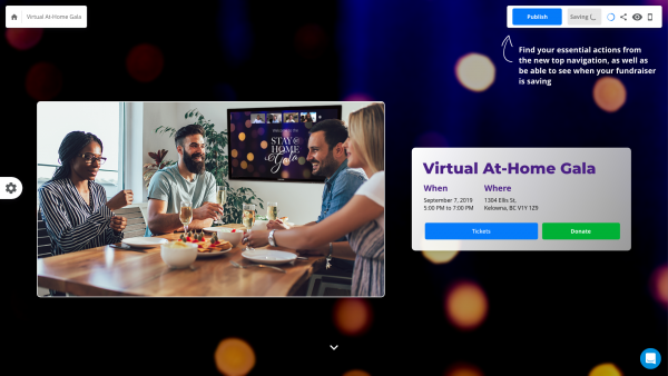
We have updated the page builder so that it’s even faster and easier to create beautiful fundraising pages with dynamic content.

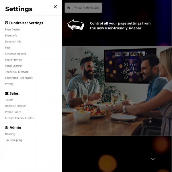
Fundraiser settings at your fingertips
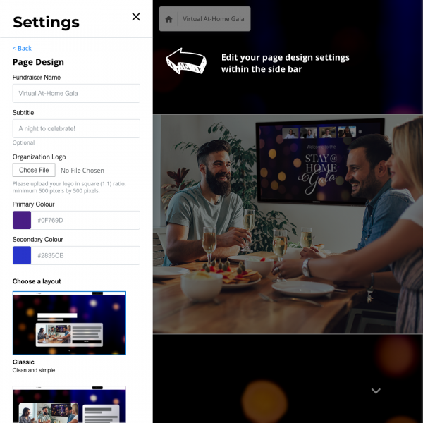
We’ve moved all the settings you need to manage your event from the dashboard to the page builder itself. Everything you need to customize and publish your page is accessible from one menu.

Powerful and flexible
The new settings menu has it all. Manage your tax receipts, tickets and donations, and custom messages for your donors.

Publish and share to start fundraising today
Located in the top right corner, you can preview, publish, and share your page with ease. You can also see what your page looks like on mobile!
Click this link to watch a video overview.
More exciting updates coming soon
The product team at trellis has been busy, and we’ll have more updates to share soon about our express on-boarding and templates.
Tell us what you think!
We’re always curious to hear what features you would like to see next. Click here to let us know your ideas.
These new features will be making their debut on trellis next week. Make sure to check back then and try them out for yourself.


